1 What It Means
The small dot placed above the lowercase letters i and j in written and printed English.
2 Caught in the Wild
Not one tittle of the law shall be changed until all be fulfilled.
Tyndale Bible, Matthew 5:18 (translation) · 1526
3 Where It Comes From
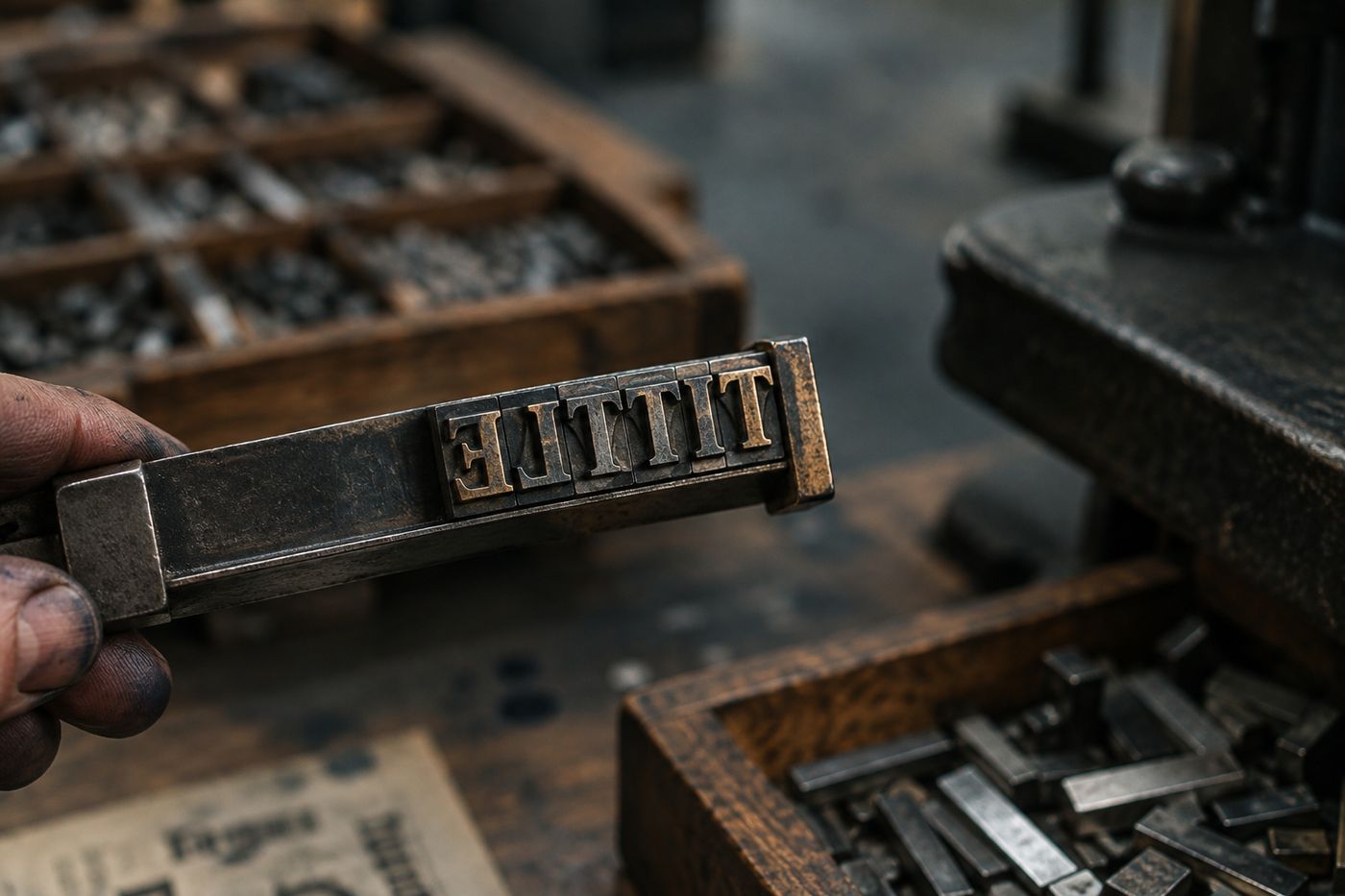
Tittle comes from Middle English titel, itself borrowed from Latin titulus, meaning a small mark or label, the same root that gives us title. Medieval scribes used it for any tiny stroke or point added to a letter, not just the one over i and j. Over time the general sense faded from everyday speech, surviving mainly in the fixed biblical phrase jot and tittle, where jot meant the smallest Hebrew letter and tittle meant its smallest embellishing stroke. Once that phrase became a fossil quotation rather than living usage, the word had nowhere left to go except into typography manuals, where it quietly kept its precise, narrow job.
4 The World Behind the Word
Typesetters and type designers still need a word for that dot because the dot is not decorative, it is functional. Drop it and i collapses into l or a badly kerned dotless variant used in certain sans-serif fonts and titling caps, where the dotless i is a deliberate design choice with its own name problem. Font foundries distinguish the tittle from other small marks like the dieresis dots over a vowel or the dot on a lowercase j, because each one behaves differently when a font is italicized, condensed, or paired with accents. A designer setting a diacritic above an i has to know whether to drop the tittle first or stack the mark on top of it, and getting that wrong is a visible, embarrassing error in professional type.
5 Use It Yourself
Pull this out when someone obsesses over a font detail nobody else notices, the group chat equivalent of correcting kerning on a wedding invitation. It also works as a quiet flex when someone quotes 'jot and tittle' without knowing what a tittle actually is. Nobody will think you're insulting them. They will think you read strange dictionaries for fun, which, at this point, you do.
Try it out loud
The font renders the tittle too close to the stem, so every lowercase i looks slightly congested.
🗝️The Deep Cut File
The dotless lowercase i used in Turkish is not a font quirk, it is a separate letter with its own uppercase form, distinct from dotted İ, because Turkish treats the tittle's presence or absence as meaningful, not decorative. English speakers rarely notice this until autocorrect or search engines mishandle Turkish text, silently swapping dotted and dotless i as though they were interchangeable. Type designers who ignore the distinction produce fonts that quietly break Turkish words, which is why serious multilingual type specimens test the tittle as carefully as they test full accented characters.